Have you used Text to Speech tools before? Did you find it useful? Did you try out some of the different voices? What impact did the different voices have on your ability to absorb information?
The only prior use of a Text To Speech software that I have had in the past has been the Text To Speech that is available on iPhone when texting. My experiences with that have not been very good as I have noticed that sometimes it can mess up words and if you are trying to say a name of a place or person it has a hard time hearing that and writing it correctly. When using it during this module I found it helpful in the sense that it allowed me to hear someone saying what I wrote and that helped me with punctuation as I heard some run on sentences that I had or other grammatical errors. I didn’t try multiple voices just because the voice that I initially chose did well in helping me understand what I had wrote.
Graphic design is inherently visual – what additions or modifications could you make to ensure that learners with visual impairments have access to the same information in an infographic in an online setting?
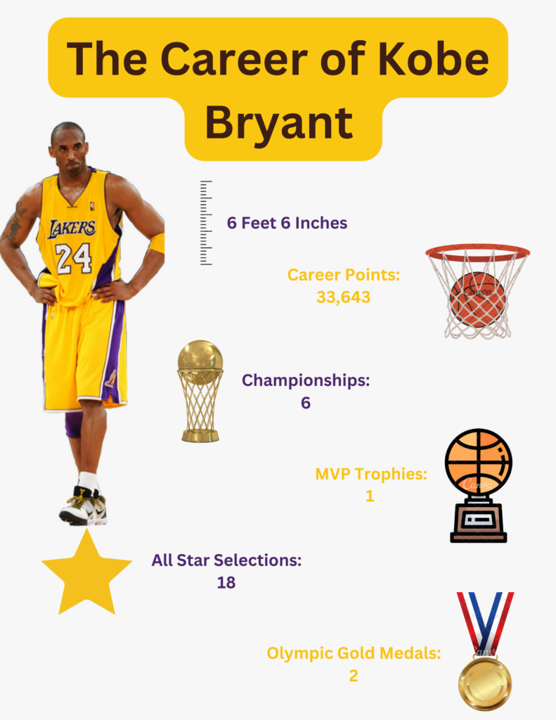
When going through this module and then at the end creating the infographic, it crossed my mind that the infographic that I was making although it is easy for most people to read this it may not be accessible to all. One of those groups include visually impaired individuals, and I began to think of ways to make it so they have the ability to access these infographics and have the same access to the information presented on there as everyone else does. I think that making infographics that have a text to speech button on each little part of text as well as describing the image that the text might be looking at is one of the easier ways to accomplish this. Another and maybe even more inclusive way us to have someone narrate what is on the infographic and give the individuals who are visually impaired the ability to have someone narrate every part of the infographic along with describing the images. In my opinion this would allow the visually impaired individual to get a sense of the message that the infographic is trying to convey by the tone of voice the narrator might be using or other thing, and this would be better than just a monotone voice reading textboxes that appear on the infographic.
Kobe Bryant Infographic

WAVE Report Screenshot

One thing that surprised me from this WAVE Report is that there were contrast errors. I thought that the different colours would increase the contrast but I think that there is more that I could do to make the contrast better making it more engaging.
Leave a Reply
You must be logged in to post a comment.